Hello all, for a while I’ve been wanting to diversify the content on my blog to include general data science and visualization samples. I finally got a burst of motivation this weekend when I was casually studying for the GRE and came across a figure in a practice test that, in my opinion, is an example of a failed visualization. Figure 1 below shows the original figure which was followed by a series of basic data interpretation questions.

Now before we dive into this, I’m sure the GRE purposefully uses unhelpful visualizations to ensure test takers understand the components of a graph (legend, axes, etc.) well enough to extract the necessary information via brute force inspection. Either way, we’re going to make this figure more accessible and visualizing assisting. There are 3 serious issues that I have with it.
- The date ranges (top series) and individual months (bottom series) are seemingly unrelated but are plotted on the same graph using a broken y-axis with a discontinuous scale. The two parts of the graph are pretty well distinguished but to avoid associating their patterns/trends with each other, it would be recommended to separate these plots.
- The only way to understand the time period for each line is by looking at the markers and legend. Besides their filling, these markers have no connection to their corresponding time periods.
- The x-axis contains the different charitable causes where their order is irrelevant. By using a line plot with markers, it gives you the impression that order is important and that the upward trend, for example, could matter.
To solve the first problem, the plots are separated and placed side-by-side in Figure 2 below. Though not a huge improvement, the y-axes are now appropriate and the date ranges are clearly separated from the individual months.

Now to fix the second problem, we drop the meaningless markers and adopt a grayscale where more recent dates are darker than earlier dates. It still requires you to refer to the legend but once you understand the direction of the grayscale, the figure becomes much more digestible as seen below.

Based on the dates in the figure, I assume adding color was not an option at the time of its creation but we’re going to go ahead and spice it up with some color now. Finally, to fix the third problem, the x-axis is now time, increasing left to right, and the individual lines represent the different charitable causes. The figure is immediately more intuitive as now trends along the x-axis have meaning. As seen in Figure 4 below, in the date range plot, your attention is immediately drawn to the increase in disaster relief between the 2nd and 3rd date range. In the monthly plot, the uniqueness of the disaster relief and child safety lines compared to the others is quickly realized.

Now that we have fixed my issues with the original figure, we have a clean visualization. There are still some improvements we can make though. Having to track the individual lines and values can be visually straining. It is much easier on our eyes to compare 2-D areas so by switching to a stacked bar chart, Figure 5 becomes even more accessible. The significant changes in private donations to disaster relief are still very prominent in the new figure. Unfortunately, by switching chart types, we lose information on the exact donation values for each cause in exchange for gaining information on the total amount of private donations.

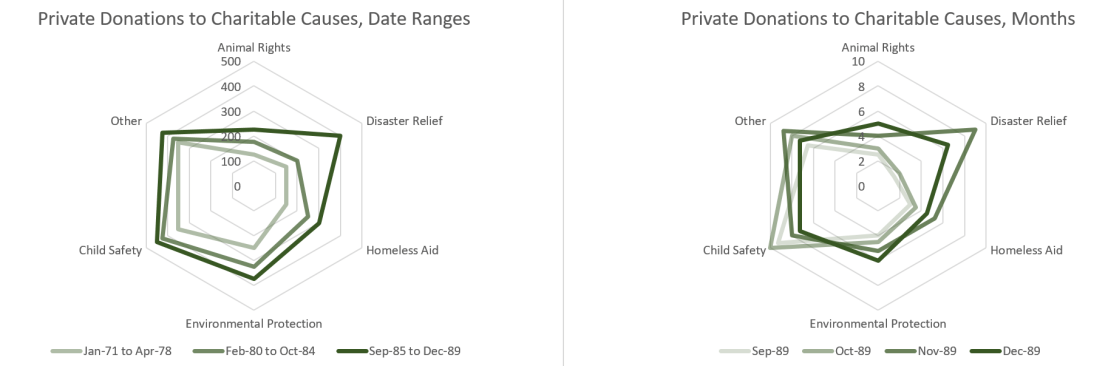
Depending on the purpose of the figure, the trade-off between individual donation values and the total donation values may or may not be worth it. A somewhat happy medium when working with a stacked bar chart, with this many categories, is to use a radar chart instead. As seen in Figure 6 below, the individual donation values are available and by considering the area of the series, the total donation values can be extrapolated. Additionally, a monochromatic scale can be used to highlight time component of the series.
I hope this example highlighted the importance of choosing an appropriate visualization based on your audience and the aspects of the data that you want emphasized. Especially when working with a small data set like this, the details matter. Thanks for reading!