Category: R

Cointegration, Correlation, and Log Returns

Co-Author: Eric Kammers

I recently created a Twitter account for the blog where I will curate and comment on content I find interesting related to finance, data science, and data visualization. Please follow me at @Quantoisseur (see the embedded stream on the sidebar). Enjoy the post!


The differences between correlation and cointegration can often be confusing. While there are some helpful explanations online, I wasn’t satisfied with the visual examples. When looking at a plot of an actual pair of symbols where the correlation and cointegration test results differ, it can be difficult to pinpoint which portions of the time series are responsible for these separate properties. To solve this, I decided to produce some basic examples with sinusoidal functions so I could solidify my understanding of these concepts.

First, let’s highlight the difference between cointegration and correlation. Correlation is more familiar to most of us, especially outside of the financial industry. Correlation is a measure of how well two variables move in tandem together over time. Two common correlation measures are Pearson’s product-moment coefficient and Spearman’s ranks-order coefficient. Both coefficients range from -1, perfect negative correlation, to 0, no correlation, to 1, perfect positive correlation. Positive correlation means that the variables move in tandem in the same direction while negative correlation means that they move in tandem but in opposite directions. When calculating correlation, we look at returns rather than price because returns are normalized across differently priced assets. The main difference between the two correlation coefficients is that the Spearman coefficient measures the monotonic relationship between two variables, while the Pearson coefficient measures their linear relationship. Figure 1 below shows how the different coefficients behave when two variables exhibit either a linear or nonlinear relationship. Notice how the Spearman coefficient remains 1 for both scenarios since the relationship in both cases is perfectly monotonic.

fig1
Figure 1: Pearson vs Spearman for Nonlinear and Linear Functions

Based on the distributions of the data, these coefficients can behave differently which I will explore with additional examples later in this post. Here are some resources for further clarification on the Pearson and Spearman coefficients.

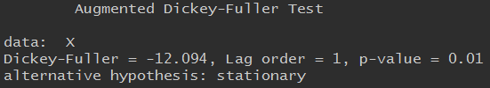
Now, cointegration tests do not measure how well two variables move together, but rather whether the difference between their means remains constant. Often, variables with high correlation will also be cointegrated, and vice versa, but this isn’t always the case. In contrast to correlation, when testing for cointegration we use prices rather than returns since we’re more interested in the trend between the variables’ means over time than in the individual price movements. There are multiple cointegration tests, but in this case, I’ll be using the Augmented Dicky-Fuller test to evaluate the stationarity of the residuals from the linear model created with the pair’s price series.

Second, using log returns for financial calculations is, in many cases, preferable to using simple returns. There are many resources online explaining the advantages and disadvantages of using log returns. We will not dive into this topic too much, but some of the advantages are due to assuming a log normal distribution which makes them easier to work with and gives them convenient properties like time-additivity. Figure 2 below shows the relationship between log and simple returns.

fig2
Figure 2: Relationship between Simple and Log Returns

Furthermore, correlation is a second moment calculation meaning that it is only appropriate if higher moments are insignificant. Using log returns is better so we can ensure the higher moments are negligible and avoid having to use copulas.

Now with this framework, we can introduce some visual examples. Figure 3 below will be our baseline example which we will adjust in a variety of ways to examine how the values in the table react. In this figure, the red and green series are identical but are oscillating around different mean prices. The difference between the means of the variables is static over time which is why ADF test confirms their cointegration. The price, simple returns, and log returns correlations are all 1, perfectly positively correlated.

fig3
Figure 3: Baseline Example, Perfect Cointegration and Correlation

By phase shifting the green price series as seen in Figure 4 below, all the correlation coefficients now indicate a lack of correlation between the series. As expected, the pair remains cointegrated.

fig4
Figure 4: Perfect Cointegration but No Correlation

I now put the pair back in sync and the red series is adjusted as seen in Figure 5. The pair isn’t cointegrated anymore since the difference between their means fluctuates over time. The returns correlation coefficients agree that the series are strongly correlated while the price only supports a weak correlation.

Figure_Update_Same
Figure 5: No Cointegration but Strong Returns Correlation

In the above example, the Pearson and Spearman coefficients begin to diverge but now we’ll look at an example where they differ significantly. Since the Spearman coefficient is based on the rank-order of the variables and not the actual distance between them, it is known to be more resilient to large deviations and outliers. We can test this by adding an anomaly, possibly a data outage, to the top series by randomly choosing a period of 25 data points to set equal to 1. The effect can be observed in the table accompanying Figure 6 below. The Spearman coefficient supports strong positive correlation while the Pearson coefficient claims there is little to no correlation.

fig6
Figure 6: Outliers Effect on Pearson and Spearman Coefficient Calculations

The final example we will look at it is a situation where the returns are not strongly correlated but the prices are. Instinctively, I think I would side with the returns correlation results in Figure 7.

fig7
Figure 7: High Price Correlation but Low Returns Correlation

One aspect of these correlation tests we have been overlooking, is the distributions of the variables. In these sinusoidal examples, neither simple nor log returns are normally distributed. It is often advertised that the Pearson correlation coefficient requires the data to be normally distributed. One counter argument is the distribution only needs to be symmetric, not necessarily normal. The Spearman coefficient is a nonparametric statistic and thus does not require a normal distribution. In many of the previous examples, the two coefficients are functionally the same despite the odd distribution of the log returns. In Figure 8 below, we take our basic series and add random noise to one of them which creates a more normal distribution. The normality of these log returns are tested with the Shapiro-Wilk normality test. As seen in the right histogram, our basic sinusoidal wave’s log returns reject the null hypothesis that they are normally distributed. In the left histogram, the noisy wave’s log returns fail to reject the null hypothesis.

fig8

fig9.png
Figure 8: Distributions and Price Series when Noise is Added to One Series

Despite changing one variable’s distribution, the Pearson and Spearman coefficients remain about the same. Additionally, as seen in Figure 9 below, normalizing both variable’s distributions does not cause the coefficients to differ.

fig10.png
Figure 9: Noise Added to Both Price Series

These distribution examples do not fully support a side of the debate but I’m not convinced that the Pearson coefficient strictly requires normality.

Playing around with these examples was very helpful for my understanding of cointegration, correlation, and log returns. It is now very clear to me why returns, particularly log returns, are used when calculating correlation and why price is used to test for cointegration. The choice between using the Pearson or Spearman correlation coefficient is slightly more difficult but it can’t hurt to look at both and see how it impacts your data decisions!

The code to generate all the figures in this post can be found here.


Eric Kammers is a recent graduate of the University of Washington (2017) where he studied Industrial & Systems Engineering. He is actively seeking opportunities that will add value to his current skill-set. He is a strong-willed, self-driven individual who has the urge for life-time learning. He loves mathematics and statistics, especially applying their methods to practical problems in data science and engineering. LinkedIn: https://www.linkedin.com/in/ekammers/

Cointegrated ETF Pairs Part II

Update 5/17: As discussed in the comments, the reason the results are so exaggerated is because it is missing portfolio rebalancing to account for the changing hedge ratio. It would be interesting to try an adaptive hedge ratio that requires only weekly or monthly rebalancing to see how legitimately profitable this type of strategy could be.

Welcome back! This week’s post will backtest a basic mean reverting strategy on a cointegrated ETF pair time series constructed using the methods described in part I. Since the EWA (Australia) – EWC (Canada) pair was found to be more naturally cointegrated, I decided to run the rolling linear regression model (EWA chosen as the dependent variable) with a lookback window of 21 days on this pair to create the spread below.

1
Figure 1: Cointegrated Pair, EWA & EWC

With the adaptive hedge ratio, the spread looks well suited to backtest a mean reverting strategy on. Before that, we should check what the minimum capital required to trade this spread is. Though everyone has a different margin requirement, I thought it would be useful to walkthrough how you would calculate the capital required. In this example we assume our broker allows a margin of 50%. We first will compute the daily ratio between the pair, EWC/EWA. This ratio represents the amount of EWA shares for each share of EWC that must be owned to have an equal dollar move for every 1% move. The ratio fluctuates daily but has a mean of 1.43. This makes sense because EWC, on average, trades at higher price. We then multiply these ratios by the rolling beta. Then for reference, we can fix the held EWC shares to 100 and multiply the previous values (ratios*rolling beta) by 100 to determine the amount of EWA shares that would be held. The amount of capital required to hold this spread can then be calculated with the equation: margin*abs((EWC price * 100) + (EWA price * calculated shares)). This is plotted for our example below.

newnew
Figure 2: Required Capital

From this plot we can see that the series has a max value of $5,466 which is not a relatively large required capital. I hypothesize that the less cointegrated a pair is, the higher the minimum capital will be (try the EWZ-IGE pair).

We can now go ahead and backtest the figure 1 time series! A common mean reversal strategy uses Bollinger Bands, where we enter positions when the price deviates past a Z-score/standard deviation threshold from the mean. The exit signals can be determined from the half-life of its mean reversion or it can be based on the Z-score. To avoid look-ahead bias, I calculated the mean, standard deviation, and Z-score with a rolling 50-day window. Unfortunately, this window had to be chosen with data-snooping bias but was a reasonable choice. This backtest will also ignore transaction costs and other spread execution nuances but should still reasonably reflect the strategy’s potential performance. I decided on the following signals:

  • Enter Long/Close Short: Z-Score < -1
  • Close Long/Enter Short: Z-Score > 1

This is a standard Bollinger Bands strategy and results were encouraging.

3

4

Though it made a relatively small amount of trades over 13 years, it boasts an impressive 2.7 Sharpe Ratio with 97% positive trades. Below on the left we can see the strategy’s performance vs. SPY (using very minimal leverage) and on the right the positions/trades are shown.

new2

Overall, this definitely supports the potential of trading cointegrated ETF pairs with Bollinger Bands. I think it would be interesting to explore a form of position sizing based on either market volatility or the correlation between the ETF pair and another symbol/ETF. This concludes my analysis of cointegrated ETF pairs for now.

Acknowledgments: Thank you to Brian Peterson and Ernest Chan for explaining how to calculate the minimum capital required to trade a spread. Additionally, all of my blog posts have been edited prior to being published by Karin Muggli, so a huge thank you to her!

Note: I’m currently looking for a full-time quantitative research/trading position beginning summer/fall 2017. I’m currently a senior at the University of Washington, majoring in Industrial and Systems Engineering and minoring in Applied Mathematics. I also have taken upper level computer science classes and am proficient in a variety of programming languages. Resume: https://www.pdf-archive.com/2017/01/31/coltonsmith-resume-g/. LinkedIn: https://www.linkedin.com/in/coltonfsmith. Please let me know of any open positions that would be a good fit for me. Thanks!

Full Code:

detach("package:dplyr", unload=TRUE)
require(quantstrat)
require(IKTrading)
require(DSTrading)
require(knitr)
require(PerformanceAnalytics)
require(quantstrat)
require(tseries)
require(roll)
require(ggplot2)

# Full test
initDate="1990-01-01"
from="2003-01-01"
to="2015-12-31"

## Create "symbols" for Quanstrat
## adj1 = EWA (Australia), adj2 = EWC (Canada)

## Get data
getSymbols("EWA", from=from, to=to)
getSymbols("EWC", from=from, to=to)
dates = index(EWA)

adj1 = unclass(EWA$EWA.Adjusted)
adj2 = unclass(EWC$EWC.Adjusted)

## Ratio (EWC/EWA)
ratio = adj2/adj1

## Rolling regression
window = 21
lm = roll_lm(adj2,adj1,window)

## Plot beta
rollingbeta <- fortify.zoo(lm$coefficients[,2],melt=TRUE)
ggplot(rollingbeta, ylab="beta", xlab="time") + geom_line(aes(x=Index,y=Value)) + theme_bw()

## Calculate the spread
sprd <- vector(length=3273-21)
for (i in 21:3273) {
sprd[i-21] = (adj1[i]-rollingbeta[i,3]*adj2[i]) + 98.86608 ## Make the mean 100
}
plot(sprd, type="l", xlab="2003 to 2016", ylab="EWA-hedge*EWC")

## Find minimum capital
hedgeRatio = ratio*rollingbeta$Value*100
spreadPrice = 0.5*abs(adj2*100+adj1*hedgeRatio)
plot(spreadPrice, type="l", xlab="2003 to 2016", ylab="0.5*(abs(EWA*100+EWC*calculatedShares))")

## Combine columns and turn into xts
close = sprd
date = as.data.frame(dates[22:3273])
data = cbind(date, close)
dfdata = as.data.frame(data)
xtsData = xts(dfdata, order.by=as.Date(dfdata$date))
xtsData$close = as.numeric(xtsData$close)
xtsData$dum = vector(length = 3252)
xtsData$dum = NULL
xtsData$dates.22.3273. = NULL

## Add SMA, moving stdev, and z-score
rollz<-function(x,n){
avg=rollapply(x, n, mean)
std=rollapply(x, n, sd)
z=(x-avg)/std
return(z)
}

## Varying the lookback has a large affect on the data
xtsData$zScore = rollz(xtsData,50)
symbols = 'xtsData'

## Backtest
currency('USD')
Sys.setenv(TZ="UTC")
stock(symbols, currency="USD", multiplier=1)

#trade sizing and initial equity settings
tradeSize <- 10000
initEq <- tradeSize

strategy.st <- portfolio.st <- account.st <- "EWA_EWC"
rm.strat(portfolio.st)
rm.strat(strategy.st)
initPortf(portfolio.st, symbols=symbols, initDate=initDate, currency='USD')
initAcct(account.st, portfolios=portfolio.st, initDate=initDate, currency='USD',initEq=initEq)
initOrders(portfolio.st, initDate=initDate)
strategy(strategy.st, store=TRUE)

#SIGNALS
add.signal(strategy = strategy.st,
name="sigFormula",
arguments = list(label = "enterLong",
formula = "zScore < -1", cross = TRUE), label = "enterLong") add.signal(strategy = strategy.st, name="sigFormula", arguments = list(label = "exitLong", formula = "zScore > 1",
cross = TRUE),
label = "exitLong")

add.signal(strategy = strategy.st,
name="sigFormula",
arguments = list(label = "enterShort",
formula = "zScore > 1",
cross = TRUE),
label = "enterShort")

add.signal(strategy = strategy.st,
name="sigFormula",
arguments = list(label = "exitShort",
formula = "zScore < -1",
cross = TRUE),
label = "exitShort")

#RULES
add.rule(strategy = strategy.st,
name = "ruleSignal",
arguments = list(sigcol = "enterLong",
sigval = TRUE,
orderqty = 15,
ordertype = "market",
orderside = "long",
replace = FALSE,
threshold = NULL),
type = "enter")

add.rule(strategy = strategy.st,
name = "ruleSignal",
arguments = list(sigcol = "exitLong",
sigval = TRUE,
orderqty = "all",
ordertype = "market",
orderside = "long",
replace = FALSE,
threshold = NULL),
type = "exit")

add.rule(strategy = strategy.st,
name = "ruleSignal",
arguments = list(sigcol = "enterShort",
sigval = TRUE,
orderqty = -15,
ordertype = "market",
orderside = "short",
replace = FALSE,
threshold = NULL),
type = "enter")

add.rule(strategy = strategy.st,
name = "ruleSignal",
arguments = list(sigcol = "exitShort",
sigval = TRUE,
orderqty = "all",
ordertype = "market",
orderside = "short",
replace = FALSE,
threshold = NULL),
type = "exit")

#apply strategy
t1 <- Sys.time()
out <- applyStrategy(strategy=strategy.st,portfolios=portfolio.st)
t2 <- Sys.time()
print(t2-t1)

#set up analytics
updatePortf(portfolio.st)
dateRange <- time(getPortfolio(portfolio.st)$summary)[-1]
updateAcct(portfolio.st,dateRange)
updateEndEq(account.st)

#Stats
tStats <- tradeStats(Portfolios = portfolio.st, use="trades", inclZeroDays=FALSE)
tStats[,4:ncol(tStats)] <- round(tStats[,4:ncol(tStats)], 2)
print(data.frame(t(tStats[,-c(1,2)])))

#Averages
(aggPF <- sum(tStats$Gross.Profits)/-sum(tStats$Gross.Losses))
(aggCorrect <- mean(tStats$Percent.Positive))
(numTrades <- sum(tStats$Num.Trades))
(meanAvgWLR <- mean(tStats$Avg.WinLoss.Ratio))

#portfolio cash PL
portPL <- .blotter$portfolio.EWA_EWC$summary$Net.Trading.PL

## Sharpe Ratio
(SharpeRatio.annualized(portPL, geometric=FALSE))

## Performance vs. SPY
instRets <- PortfReturns(account.st)
portfRets <- xts(rowMeans(instRets)*ncol(instRets), order.by=index(instRets))

cumPortfRets <- cumprod(1+portfRets)
firstNonZeroDay <- index(portfRets)[min(which(portfRets!=0))]
getSymbols("SPY", from=firstNonZeroDay, to="2015-12-31")
SPYrets <- diff(log(Cl(SPY)))[-1]
cumSPYrets <- cumprod(1+SPYrets)
comparison <- cbind(cumPortfRets, cumSPYrets)
colnames(comparison) <- c("strategy", "SPY")
chart.TimeSeries(comparison, legend.loc = "topleft", colorset = c("green","red"))

## Chart Position
rets <- PortfReturns(Account = account.st)
rownames(rets) <- NULL
charts.PerformanceSummary(rets, colorset = bluefocus)

Cointegrated ETF Pairs Part I

The next two blog posts will explore the basics of the statistical arbitrage strategies outlined in Ernest Chan’s book, Algorithmic Trading: Winning Strategies and Their Rationale. In the first post we will construct mean reverting time series data from cointegrated ETF pairs. The two pairs we will analyze are EWA (Australia) – EWC (Canada) and IGE (NA Natural Resources) – EWZ (Brazil).

1
Figure 1&2: Blue: EWA (left) & EWZ (right), Red: EWC (left) & IGE (right)
2
Figure 3&4: Scatter Plots

EWA-EWC is a notable ETF pair since both Australia and Canada’s economies are commodity based. Looking at the scatter plot, it seems likely that they cointegrate because of this. IGE-EWZ seems less likely to cointegrate but we will discover that it is possible to salvage a stationary series with a statistical adjustment. A stationary, mean reverting series implies that the variance of the log price increases slower than that of a geometric random walk.

Running a linear regression model with EWA as the dependent variable and EWC as the independent variable we can use the resulting beta as the hedge ratio to create the data series below.

3
Figure 5: Cointegrated Pair, EWA & EWC

It appears stationary but we will run a few statistical tests to support this conclusion. The first test we will run is the Augmented Dickey-Fuller, which tests whether the data is stationary or trending. We set the lag parameter, k, to 1 since the change in price often has serial correlations.

4

The ADF test rejects the null hypothesis and supports the stationarity of the series with a p-value < 0.04. The next test we will run is the Hurst Exponent, which will analyze the variance of the log price and compare it to that of a geometric random walk. A geometric random walk has H=0.5, a mean reverting series has H<0.5, and a trending series has H>0.5. Running this test on the log residuals of the linear model gives a Hurst Exponent of 0.27, supporting the ADF’s conclusion. Since this series is now surely stationary, the final analysis we will do is find its half-life of the mean reversion. This is useful for trading as it gives you an idea of what the holding period of the strategy will be. The calculation of the half-life involves regressing y(t)-y(t-1) against y(t-1) and using the lambda found. See my code for further explanation. The half-life of this series is found to be 67 days.

Next, we will look at the IGE-EWZ pair. Running a linear regression model with IGE as the dependent variable and EWZ as the independent variable we can use the resulting beta as the hedge ratio to create the data series below.

5
Figure 6: Cointegrated Pair, EWZ & IGE

Compared to the EWA-EWC pair, this looks a lot less stationary which makes sense considering the price series and scatter plot. Additionally, the ADF test is inconclusive.

6

The half-life of its mean reversion is calculated to be 344 days. In this form, it is definitely not a very practical pair to trade. Something that may improve the stationarity of this time series is to use an adaptive hedge ratio, determined from using a rolling linear regression model with a designated lookback window. Obviously, the shorter the lookback window, the more that the beta/hedge ratio will fluctuate. Though this would require daily portfolio adjustments, ideally the stationarity of the series will increase substantially. I began with a lookback window of 252, the number of trading days in a year, but it didn’t have large enough of an impact.  Therefore, we will try 21, the average number of trading days in a month, which will result in a significant impact. Without the rolling regression, the beta/hedge ratio was 0.42. Below you can see how the beta changes over time and how it affects the mean reverting data series.

7
Figure 7: Beta/Hedge Ratio vs. Time
8
Figure 8: Cointegrated Pair, EWZ & IGE, w/ Adaptive Hedge Ratio

9

With the adaptive hedge ratio, the ADF test strongly concludes that the time series is stationary. This also significantly cuts down the half-life of the mean reversion to only 33 days.

Though there are a lot more analysis techniques for cointegrated ETF pairs, and even triplets, this post explored the basics of creating two stationary data series. In next week’s post, we will implement some mean reversion trading strategies on these pairs. See ya next week!

Full Code:

require(quantstrat)
require(tseries)
require(roll)
require(ggplot2)

## EWA (Australia) - EWC (Canada)
## Get data
getSymbols("EWA", from="2003-01-01", to="2015-12-31")
getSymbols("EWC", from="2003-01-01", to="2015-12-31")

## Utilize the backwards-adjusted closing prices
adj1 = unclass(EWA$EWA.Adjusted)
adj2 = unclass(EWC$EWC.Adjusted)

## Plot the ETF backward-adjusted closing prices
plot(adj1, type="l", xlab="2003 to 2016", ylab="ETF Backward-Adjusted Price in USD", col="blue")
par(new=T)
plot(adj2, type="l", axes=F, xlab="", ylab="", col="red")
par(new=F)

## Plot a scatter graph of the ETF adjusted prices
plot(adj1, adj2, xlab="EWA Backward-Adjusted Prices", ylab="EWC Backward-Adjusted Prices")

## Linear regression, dependent ~ independent
comb1 = lm(adj1~adj2)

## Plot the residuals or hedged pair
plot(comb1$residuals, type="l", xlab="2003 to 2016", ylab="Residuals of EWA and EWC regression")

beta = coef(comb1)[2]
X = vector(length = 3273)
for (i in 1:3273) {
X[i]=adj1[i]-beta*adj2[i]
}

plot(X, type="l", xlab="2003 to 2016", ylab="EWA-hedge*EWC")

## ADF test on the residuals
adf.test(comb1$residuals, k=1)
adf.test(X, k=1)

## Hurst Exponent Test
HurstIndex(log(comb1$residuals))

## Half-life
sprd = comb1$residuals
prev_sprd <- c(sprd[2:length(sprd)], 0)
d_sprd <- sprd - prev_sprd
prev_sprd_mean <- prev_sprd - mean(prev_sprd)
sprd.zoo <- merge(d_sprd, prev_sprd_mean)
sprd_t <- as.data.frame(sprd.zoo)

result <- lm(d_sprd ~ prev_sprd_mean, data = sprd_t)
half_life <- -log(2)/coef(result)[2]

#######################################################################################################

## EWZ (Brazil) - IGE (NA Natural Resource)
## Get data
getSymbols("EWZ", from="2003-01-01", to="2015-12-31")
getSymbols("IGE", from="2003-01-01", to="2015-12-31")

## Utilize the backwards-adjusted closing prices
adj1 = unclass(EWZ$EWZ.Adjusted)
adj2 = unclass(IGE$IGE.Adjusted)

## Plot the ETF backward-adjusted closing prices
plot(adj1, type="l", xlab="2003 to 2016", ylab="ETF Backward-Adjusted Price in USD", col="blue")
par(new=T)
plot(adj2, type="l", axes=F, xlab="", ylab="", col="red")
par(new=F)

## Plot a scatter graph of the ETF adjusted prices
plot(adj1, adj2, xlab="EWA Backward-Adjusted Prices", ylab="EWC Backward-Adjusted Prices")

## Rolling regression
## Trading days
## 252 = year
## 21 = month
window = 21
lm = roll_lm(adj1,adj2,window)

## Plot beta
rollingbeta <- fortify.zoo(lm$coefficients[,2],melt=TRUE)
ggplot(rollingbeta, ylab="beta", xlab="time") + geom_line(aes(x=Index,y=Value)) + theme_bw()

## X should be the shifted residuals
X <- vector(length=3273-21)
for (i in 21:3273) {
X[i-21] = adj2[i]-rollingbeta[i,3]*adj1[i]
}

plot(X, type="l", xlab="2003 to 2016", ylab="IGE-hedge*EWZ")

MACD + SMI Trend Following and Parameter Optimization

Finally a somewhat profitable strategy to analyze! This post will walk through the development of my MACD + SMI strategy, including my experience with parameter optimization and trailing stops. This strategy began with an interest in the Moving Average Convergence/Divergence oscillator (MACD), which I hadn’t yet explored. Also, since the two previous strategies I analyzed were mean-reversion strategies, I thought it’d be good to try out a trend-following strategy. The MACD uses two trend-following moving averages to create a momentum indicator. I used the standard 12-period fast EMA, 26-period slow EMA, and 9-period signal EMA parameters. Although there are a lot of different signals that traders can look at when using the MACD, I kept it simple and was only interested when the MACD (fast EMA – slow EMA) was above/below the signal line. When the MACD is positive it indicates that the upside momentum is increasing, and vice versa for negative values. I then did some research to see what indicators were combined with the MACD. The two that caught my interest were the Stochastic Momentum Index (SMI) and the Chande Momentum Oscillator (CMO). The SMI compares closing prices to the median of the high/low range of prices over a certain period, which makes it a more refined and sensitive version of the Stochastic Oscillator. The values range between -100 and +100, with values less than -40 indicating a bearish trend and values greater than 40 indicating a bullish trend. Normally the SMI can be used similarly to the RSI and indicate overbought/oversold market conditions, but I wanted to focus on using it as a general trend indicator. The CMO indicator is also a momentum oscillator that can be used to confirm possible trends; my backtests confirmed its viability but I decided to center my focus on the SMI. I initially used the standard SMI threshold values (-40/+40) and backtested across the same 30 ETFs from my last post during 2003-2015.

1

2

This was my first time seeing such a high profit factor and a Sharpe ratio fairly close to 1, but unfortunately, the number of trades was too low. A minimum of 700/800 trades is necessary in this backtest to support strategy performance conclusions, however I was happy to see signs of a profitable strategy. As a note, ATR position sizing was used in every strategy backtest, which nearly doubles their Sharpe Ratio. To increase the number of trades made by this strategy I had a couple of ideas. First, since this strategy only enters long positions I tried playing around with the indicators to see if it was also good for entering short positions. This unfortunately was not a profitable attempt. Second, I thought about exploring a separate shorting strategy that made ~400 trades, and simply putting them together. I decided for the sake of analysis it would be better to stick to one main strategy this time, but this is something I’ll consider in the future. Third and finally, after learning about the ATR position sizing I have wanted to experiment with another risk management tool, trailing stops. I added a 7% trailing stop and got the results below. It sacrificed some profit factor for a better Sharpe ratio, but it also made over 700 trades. Although this seems like artificially increasing the number of trades, I was content with the results for the time being.

3

Next, I wanted to see if I could push that profit factor over 4 by optimizing the parameters, namely the SMI thresholds and trailing stop percentages. I did minor parameter optimization in my first post, but this was my first time doing it on a larger scale. I decided to split my time period in half, 2003-2009 and 2010-2015, optimize on the first period, and then use the second period for an out of sample test. I didn’t expect to see a large difference of performance between the two periods, but I was very wrong. I decided to first optimize the SMI thresholds and found ridiculously large profit factors. From this I concluded that 40 was the best entrance, but that the exit signal definitely had the largest impact. I then chose to further optimize the 40/55 (highest profit factor), 40/30 (highest Sharpe ratio), and 40/40 (arguably the best mix of profit factor and Sharpe ratio to support why they’re the standard thresholds).

Optimization 2003-2009
SMI Enter (+) SMI Close (-) Profit Factor Trades Sharpe Ratio
40 45 14.92 152 1.13
40 50 18.25 127 0.99
40 35 9.25 225 1.24
40 30 8.18 258 1.29
40 55 22.14 105 0.91
40 40 11.29 191 1.24
35 40 10.33 201 1.25
30 40 9.94 210 1.27
45 40 11.12 185 1.22
50 40 10.49 179 1.17

Then I tested the 3 strategies with 5%, 10%, 15%, and 20% trailing stops. Based on their performance, I decided which ones to test on the out of sample period and the whole sample period.

Optimization 2003-2009
SMI Enter (+) SMI Close (-) Trailing Stop Profit Factor Trades Sharpe Ratio Continue?
40 40 5% 4.95 535 1.67 *
40 40 10% 7.49 307 1.51 *
40 40 15% 7.94 248 1.36
40 40 20% 9.22 213 1.33 *
40 55 5% 5.06 528 1.7 *
40 55 10% 8.4 286 1.53 *
40 55 15% 9.45 207 1.4
40 55 20% 10.85 163 1.3 *
40 30 5% 4.97 539 1.7 *
40 30 10% 6.82 335 1.51
40 30 15%
40 30 20%
OOS 2010-2015
SMI Enter (+) SMI Close (-) Trailing Stop Profit Factor Trades Sharpe Ratio Continue?
40 40 5% 2.3 436 0.77 *
40 40 10% 2.23 277 0.53 *
40 40 15%
40 40 20% 2.23 221 0.48
40 55 0.05 2.45 430 0.82 *
40 55 10% 2.84 244 0.68 *
40 55 15%
40 55 20% 3.92 146 0.63
40 30 5% 2.17 447 0.71 *
40 30 10%
40 30 15%
40 30 20%
Whole Period
SMI Enter (+) SMI Close (-) Trailing Stop Profit Factor Trades Sharpe Ratio
40 40 5% 3.38 977 1.23
40 40 10% 3.95 586 1.01
40 40 15%
40 40 20%
40 55 0.05 3.54 963 1.27
40 55 10% 4.65 531 1.09
40 55 15%
40 55 20%
40 30 5% 3.28 993 1.21
40 30 10%
40 30 15%
40 30 20%

I was shocked at how much worse the strategies performed in the out of sample period compared to the optimization period. It was really quite interesting, and I suspect there had to be significantly different market conditions to make these differences apparent for all of the strategies. Across the board the best performing strategy was 40/55, with fairly impressive profit factors and Sharp ratios. The higher closing threshold is probably a result of the general upward trending market. This strategy performed best with a 5% or 10% trailing stop but it made almost double the trades with 5% so I decided to try my original 7% trailing stop. The results are below.

4

5

6

Overall, not a bad strategy, with a profit factor above 4 and a decent Sharpe Ratio. It also handled 2008 very nicely. The buy and hold inter-instrument correlation of the 30 ETFs is 0.71 and this strategy cuts it in half. This means it is a well diversified and risk managed portfolio strategy.

7

I’m going to continue to search for profitable strategies and maybe look for a short-term, aggressive strategy to analyze next. I also want to use other metrics, such as the Calmar or Information ratio instead of the Sharpe ratio to get a bigger picture of a strategy’s risk management. Additionally, I hope to apply R’s extensive machine learning capabilities to a strategy in the near future. Thanks for reading!

Acknowledgements: Thank you to Ilya Kipnis and Ernest Chan for their continual help.

Full code:

detach("package:dplyr", unload=TRUE)
require(quantstrat)
require(IKTrading)
require(DSTrading)
require(knitr)
require(PerformanceAnalytics)

# Full test
initDate="1990-01-01"
from="2003-01-01"
to="2015-12-31"

# Optimization set
# initDate="1990-01-01"
# from="2003-01-01"
# to="2009-12-31"

# OOS test
# initDate="1990-01-01"
# from="2010-01-01"
# to="2015-12-31"

#to rerun the strategy, rerun everything below this line
source("demoData.R") #contains all of the data-related boilerplate.

#trade sizing and initial equity settings
tradeSize <- 10000
initEq <- tradeSize*length(symbols)

strategy.st <- portfolio.st <- account.st <- "TVI_osATR"
rm.strat(portfolio.st)
rm.strat(strategy.st)
initPortf(portfolio.st, symbols=symbols, initDate=initDate, currency='USD')
initAcct(account.st, portfolios=portfolio.st, initDate=initDate, currency='USD',initEq=initEq)
initOrders(portfolio.st, initDate=initDate)
strategy(strategy.st, store=TRUE)

#parameters (trigger lag unchanged, defaulted at 1)
period = 20
pctATR = .02 #control risk with this parameter
trailingStopPercent = 0.07

#INDICATORS
add.indicator(strategy = strategy.st,
name = "MACD",
arguments = list(x = quote(Cl(mktdata)),
nFast = 12, nSlow = 26, nSig = 9,
maType = "EMA", percent = TRUE),
label = "MACD")

add.indicator(strategy = strategy.st,
name = "SMI",
arguments = list(HLC = quote(HLC(mktdata)), n = 13,
nFast = 2, nSlow = 25, nSig = 9,
maType = "EMA", bounded = TRUE),
label = "SMI")

add.indicator(strategy.st, name="lagATR",
arguments=list(HLC=quote(HLC(mktdata)), n=period),
label="atrX")

#SIGNALS
add.signal(strategy = strategy.st,
name="sigFormula",
arguments = list(label = "closeLong",
formula = "(macd.MACD < signal.MACD & SMI.SMI < -55)",
cross = TRUE),
label = "closeLong")

add.signal(strategy = strategy.st,
name="sigFormula",
arguments = list(label = "buyLong",
formula = "(macd.MACD > signal.MACD & SMI.SMI > 40)",
cross = TRUE),
label = "buyLong")

#RULES

add.rule(strategy = strategy.st,
name = "ruleSignal",
arguments = list(sigcol = "buyLong",
sigval = TRUE,
ordertype = "market",
orderside = "long",
replace=FALSE, prefer="Open", osFUN=osDollarATR,
tradeSize=tradeSize, pctATR=pctATR, atrMod="X"),
type="enter", path.dep=TRUE, label = "LE")

add.rule(strategy = strategy.st,
name = "ruleSignal",
arguments = list(sigcol = "buyLong",
sigval = TRUE,
replace = FALSE,
orderside = "long",
ordertype = "stoptrailing",
tmult = TRUE,
threshold = quote(trailingStopPercent),
orderqty = "all",
orderset = "ocolong"),
type = "chain",
parent = "LE",
label = "StopTrailingLong",
enabled = FALSE)

add.rule(strategy = strategy.st,
name = "ruleSignal",
arguments = list(sigcol = "closeLong",
sigval = TRUE,
orderqty = "all",
ordertype = "market",
orderside = "long",
threshold = NULL),
type = "exit")

enable.rule(strategy.st, type = "chain", label = "StopTrailingLong")

#apply strategy
t1 <- Sys.time()
out <- applyStrategy(strategy=strategy.st,portfolios=portfolio.st)
t2 <- Sys.time()
print(t2-t1)

#set up analytics
updatePortf(portfolio.st)
dateRange <- time(getPortfolio(portfolio.st)$summary)[-1]
updateAcct(portfolio.st,dateRange)
updateEndEq(account.st)

#Stats
tStats <- tradeStats(Portfolios = portfolio.st, use="trades", inclZeroDays=FALSE)
tStats[,4:ncol(tStats)] <- round(tStats[,4:ncol(tStats)], 2)
print(data.frame(t(tStats[,-c(1,2)])))

#Averages
(aggPF <- sum(tStats$Gross.Profits)/-sum(tStats$Gross.Losses))
(aggCorrect <- mean(tStats$Percent.Positive))
(numTrades <- sum(tStats$Num.Trades))
(meanAvgWLR <- mean(tStats$Avg.WinLoss.Ratio))

#portfolio cash PL
portPL <- .blotter$portfolio.TVI_osATR$summary$Net.Trading.PL

#Cash Sharpe
(SharpeRatio.annualized(portPL, geometric=FALSE))

#Individual instrument equity curve
# chart.Posn(portfolio.st, "IYR")

instRets <- PortfReturns(account.st)
portfRets <- xts(rowMeans(instRets)*ncol(instRets), order.by=index(instRets))

cumPortfRets <- cumprod(1+portfRets)
firstNonZeroDay <- index(portfRets)[min(which(portfRets!=0))]
getSymbols("SPY", from=firstNonZeroDay, to="2015-12-31")
SPYrets <- diff(log(Cl(SPY)))[-1]
cumSPYrets <- cumprod(1+SPYrets)
comparison <- cbind(cumPortfRets, cumSPYrets)
colnames(comparison) <- c("strategy", "SPY")
chart.TimeSeries(comparison, legend.loc = "topleft", colorset = c("green","red"))

#Correlations
instCors <- cor(instRets)
diag(instRets) <- NA
corMeans <- rowMeans(instCors, na.rm=TRUE)
names(corMeans) <- gsub(".DailyEndEq", "", names(corMeans))
print(round(corMeans,3))
mean(corMeans)