Category: Data Science
Quantifying the Impact of the Number of Decks and Depth of Penetration While Counting Blackjack
Counting Blackjack has become an interest of mine over the past few months. After learning the basics of the Hi-Lo counting strategy I thought it would be beneficial to analyze how much time I should expect to have the advantage during my trips.
The Hi-Lo Count is the most used and discussed counting strategy for Blackjack because of its simplicity and effectiveness. Each card is given a value of either -1, 0, or +1. The low cards (2-6) are given values of +1. The neutral cards (7-9) are given values of 0. The high cards (10-Ace) are given values of -1. At any point in the shoe, the running count is the summation of card values dealt up until that point. The running count at the beginning of the shoe is zero and if all cards of the shoe were dealt, it would end at zero. To calculate the true count, the running count is divided by the number of decks remaining in the shoe. This standardizes the true count, so it is comparable at any point of the shoe. The true count represents the player vs the house edge and instructs the player to increase their bet when the advantage is in their favor. The player’s advantage increases as the true count increases because there are more high cards left in the shoe, which then gives the player better hands and causes the dealer to bust more frequently. When playing perfect basic strategy, the player begins to have the advantage when the true count (TC) becomes larger than +1. If you’re interested in the details of basic strategy, card counting, and expected value, I encourage you to check out the available resources online that cover these topics thoroughly.
This advantage from counting can vary based on the number of decks being used and the depth of penetration (how far into the shoe the dealer places the shuffle card). It is widely preached that the player has a larger positive expected value when fewer decks are used with deeper penetration. Therefore, many casinos deal 6+ decks with penetration as low as 60% to make it more difficult for players to get an advantage.
To quantify the impact of penetration and the number of decks on the advantage from counting cards, I ran rudimentary simulations that dealt through shoes, one card at a time, while keeping track of the true count at each point. To start, I simply plotted the different paths of true counts for different shoes. In Figure 1 below, the paths of 1000 simulations with a shoe of 5 decks and poor penetration are shown. The true count never passes +/-10.

Since the true count depends on the number of decks remaining in the shoe, having deeper penetration can result in more extreme true counts. In Figure 2 below, the same amount of decks are used but now the shoe is dealt entirely through.

In all simulations the true count must end at zero since the running count of an entire shoe is zero. These situations when the true count is high and reverts back to zero are where the advantage from counting pays dividends. It is also clear from the simulations that the variance of the true count increases as the penetration becomes deeper which gives rise to more of these profitable periods. These periods also will return to neutral quicker though. A +5 TC could return to zero in one hand (5 cards) if there is only one deck remaining in the shoe. A +5 TC with 3 decks left would take 15 face cards to return to zero.
Next, to visualize how these simulations compare across different combinations of decks and penetration, I needed to choose what variables mattered. The average number of points per simulation where the TC > 2 quantifies the amount of points with a player advantage. Since this is dependent on the shoe size, these values were divided by the shoe size to give the percent of shoe with the advantage. Additionally, the variance of the true count was monitored because as we saw previously, a larger variance may amplify the advantage. The results are presented in Figure 3 below.
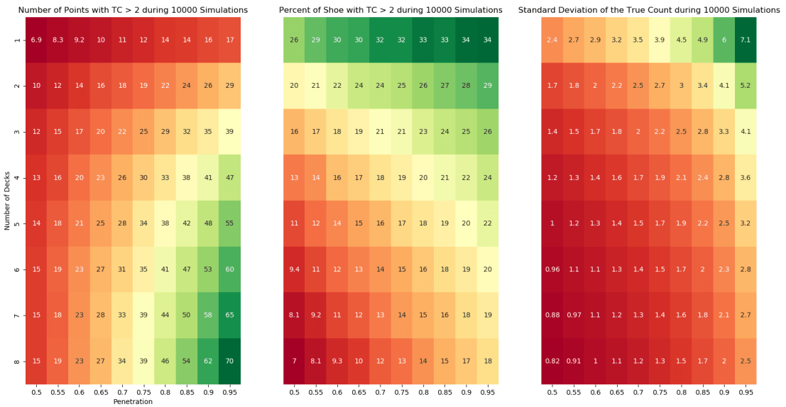
These findings are consistent with previous analysis of Blackjack. The player can expect to spend the most time with the advantage in games using fewer decks and deeper penetration. The value of this advantage time is also improved by a larger variance. The variance is more dependent on the depth of penetration than the number of decks, but both affect its value. If we look at a standard game available at many casinos of 6 decks with 65% penetration, the player will have the TC > 2 for 13% of the shoe on average with a TC standard deviation of 1.3. If we were to find a 2-deck game with 90% penetration, the player will have the TC > 2 for 28% of the shoe on average with a TC standard deviation of 4.1. If these games have the same rules, the player will gain more of an edge with fewer decks and deeper penetration.
The code for generating this analysis can be found on Github here. An interesting topic to explore next would if the path that the TC takes when reverting back to zero affects expected value and if so, how?
Acknowledgements: Thank you to James Sweetman for helping me better understand the Blackjack concepts.
Cointegration, Correlation, and Log Returns
Co-Author: Eric Kammers
I recently created a Twitter account for the blog where I will curate and comment on content I find interesting related to finance, data science, and data visualization. Please follow me at @Quantoisseur (see the embedded stream on the sidebar). Enjoy the post!
The differences between correlation and cointegration can often be confusing. While there are some helpful explanations online, I wasn’t satisfied with the visual examples. When looking at a plot of an actual pair of symbols where the correlation and cointegration test results differ, it can be difficult to pinpoint which portions of the time series are responsible for these separate properties. To solve this, I decided to produce some basic examples with sinusoidal functions so I could solidify my understanding of these concepts.
First, let’s highlight the difference between cointegration and correlation. Correlation is more familiar to most of us, especially outside of the financial industry. Correlation is a measure of how well two variables move in tandem together over time. Two common correlation measures are Pearson’s product-moment coefficient and Spearman’s ranks-order coefficient. Both coefficients range from -1, perfect negative correlation, to 0, no correlation, to 1, perfect positive correlation. Positive correlation means that the variables move in tandem in the same direction while negative correlation means that they move in tandem but in opposite directions. When calculating correlation, we look at returns rather than price because returns are normalized across differently priced assets. The main difference between the two correlation coefficients is that the Spearman coefficient measures the monotonic relationship between two variables, while the Pearson coefficient measures their linear relationship. Figure 1 below shows how the different coefficients behave when two variables exhibit either a linear or nonlinear relationship. Notice how the Spearman coefficient remains 1 for both scenarios since the relationship in both cases is perfectly monotonic.

Based on the distributions of the data, these coefficients can behave differently which I will explore with additional examples later in this post. Here are some resources for further clarification on the Pearson and Spearman coefficients.
Now, cointegration tests do not measure how well two variables move together, but rather whether the difference between their means remains constant. Often, variables with high correlation will also be cointegrated, and vice versa, but this isn’t always the case. In contrast to correlation, when testing for cointegration we use prices rather than returns since we’re more interested in the trend between the variables’ means over time than in the individual price movements. There are multiple cointegration tests, but in this case, I’ll be using the Augmented Dicky-Fuller test to evaluate the stationarity of the residuals from the linear model created with the pair’s price series.
Second, using log returns for financial calculations is, in many cases, preferable to using simple returns. There are many resources online explaining the advantages and disadvantages of using log returns. We will not dive into this topic too much, but some of the advantages are due to assuming a log normal distribution which makes them easier to work with and gives them convenient properties like time-additivity. Figure 2 below shows the relationship between log and simple returns.

Furthermore, correlation is a second moment calculation meaning that it is only appropriate if higher moments are insignificant. Using log returns is better so we can ensure the higher moments are negligible and avoid having to use copulas.
Now with this framework, we can introduce some visual examples. Figure 3 below will be our baseline example which we will adjust in a variety of ways to examine how the values in the table react. In this figure, the red and green series are identical but are oscillating around different mean prices. The difference between the means of the variables is static over time which is why ADF test confirms their cointegration. The price, simple returns, and log returns correlations are all 1, perfectly positively correlated.

By phase shifting the green price series as seen in Figure 4 below, all the correlation coefficients now indicate a lack of correlation between the series. As expected, the pair remains cointegrated.

I now put the pair back in sync and the red series is adjusted as seen in Figure 5. The pair isn’t cointegrated anymore since the difference between their means fluctuates over time. The returns correlation coefficients agree that the series are strongly correlated while the price only supports a weak correlation.

In the above example, the Pearson and Spearman coefficients begin to diverge but now we’ll look at an example where they differ significantly. Since the Spearman coefficient is based on the rank-order of the variables and not the actual distance between them, it is known to be more resilient to large deviations and outliers. We can test this by adding an anomaly, possibly a data outage, to the top series by randomly choosing a period of 25 data points to set equal to 1. The effect can be observed in the table accompanying Figure 6 below. The Spearman coefficient supports strong positive correlation while the Pearson coefficient claims there is little to no correlation.

The final example we will look at it is a situation where the returns are not strongly correlated but the prices are. Instinctively, I think I would side with the returns correlation results in Figure 7.

One aspect of these correlation tests we have been overlooking, is the distributions of the variables. In these sinusoidal examples, neither simple nor log returns are normally distributed. It is often advertised that the Pearson correlation coefficient requires the data to be normally distributed. One counter argument is the distribution only needs to be symmetric, not necessarily normal. The Spearman coefficient is a nonparametric statistic and thus does not require a normal distribution. In many of the previous examples, the two coefficients are functionally the same despite the odd distribution of the log returns. In Figure 8 below, we take our basic series and add random noise to one of them which creates a more normal distribution. The normality of these log returns are tested with the Shapiro-Wilk normality test. As seen in the right histogram, our basic sinusoidal wave’s log returns reject the null hypothesis that they are normally distributed. In the left histogram, the noisy wave’s log returns fail to reject the null hypothesis.


Despite changing one variable’s distribution, the Pearson and Spearman coefficients remain about the same. Additionally, as seen in Figure 9 below, normalizing both variable’s distributions does not cause the coefficients to differ.

These distribution examples do not fully support a side of the debate but I’m not convinced that the Pearson coefficient strictly requires normality.
Playing around with these examples was very helpful for my understanding of cointegration, correlation, and log returns. It is now very clear to me why returns, particularly log returns, are used when calculating correlation and why price is used to test for cointegration. The choice between using the Pearson or Spearman correlation coefficient is slightly more difficult but it can’t hurt to look at both and see how it impacts your data decisions!
The code to generate all the figures in this post can be found here.
Eric Kammers is a recent graduate of the University of Washington (2017) where he studied Industrial & Systems Engineering. He is actively seeking opportunities that will add value to his current skill-set. He is a strong-willed, self-driven individual who has the urge for life-time learning. He loves mathematics and statistics, especially applying their methods to practical problems in data science and engineering. LinkedIn: https://www.linkedin.com/in/ekammers/
Redesigning Data Visualization Atrocities #1
Hello all, for a while I’ve been wanting to diversify the content on my blog to include general data science and visualization samples. I finally got a burst of motivation this weekend when I was casually studying for the GRE and came across a figure in a practice test that, in my opinion, is an example of a failed visualization. Figure 1 below shows the original figure which was followed by a series of basic data interpretation questions.

Now before we dive into this, I’m sure the GRE purposefully uses unhelpful visualizations to ensure test takers understand the components of a graph (legend, axes, etc.) well enough to extract the necessary information via brute force inspection. Either way, we’re going to make this figure more accessible and visualizing assisting. There are 3 serious issues that I have with it.
- The date ranges (top series) and individual months (bottom series) are seemingly unrelated but are plotted on the same graph using a broken y-axis with a discontinuous scale. The two parts of the graph are pretty well distinguished but to avoid associating their patterns/trends with each other, it would be recommended to separate these plots.
- The only way to understand the time period for each line is by looking at the markers and legend. Besides their filling, these markers have no connection to their corresponding time periods.
- The x-axis contains the different charitable causes where their order is irrelevant. By using a line plot with markers, it gives you the impression that order is important and that the upward trend, for example, could matter.
To solve the first problem, the plots are separated and placed side-by-side in Figure 2 below. Though not a huge improvement, the y-axes are now appropriate and the date ranges are clearly separated from the individual months.

Now to fix the second problem, we drop the meaningless markers and adopt a grayscale where more recent dates are darker than earlier dates. It still requires you to refer to the legend but once you understand the direction of the grayscale, the figure becomes much more digestible as seen below.

Based on the dates in the figure, I assume adding color was not an option at the time of its creation but we’re going to go ahead and spice it up with some color now. Finally, to fix the third problem, the x-axis is now time, increasing left to right, and the individual lines represent the different charitable causes. The figure is immediately more intuitive as now trends along the x-axis have meaning. As seen in Figure 4 below, in the date range plot, your attention is immediately drawn to the increase in disaster relief between the 2nd and 3rd date range. In the monthly plot, the uniqueness of the disaster relief and child safety lines compared to the others is quickly realized.

Now that we have fixed my issues with the original figure, we have a clean visualization. There are still some improvements we can make though. Having to track the individual lines and values can be visually straining. It is much easier on our eyes to compare 2-D areas so by switching to a stacked bar chart, Figure 5 becomes even more accessible. The significant changes in private donations to disaster relief are still very prominent in the new figure. Unfortunately, by switching chart types, we lose information on the exact donation values for each cause in exchange for gaining information on the total amount of private donations.

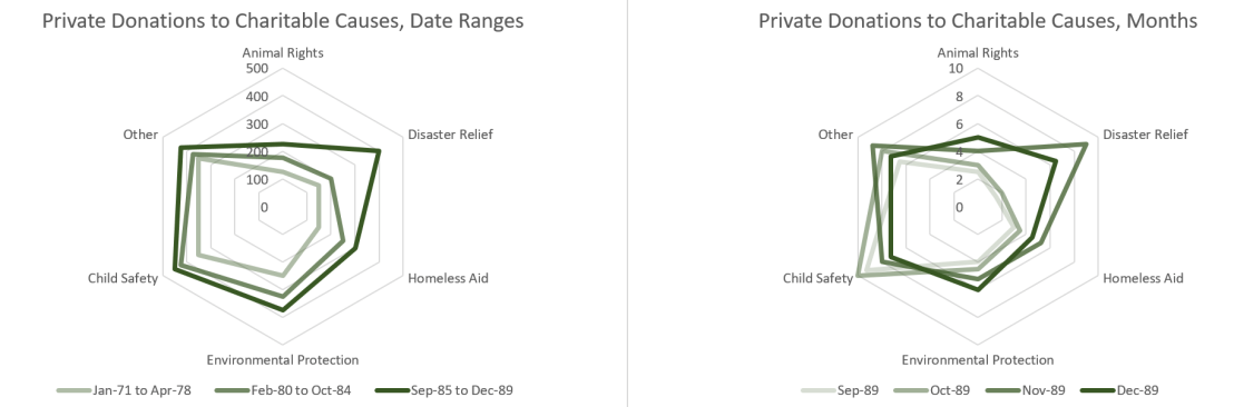
Depending on the purpose of the figure, the trade-off between individual donation values and the total donation values may or may not be worth it. A somewhat happy medium when working with a stacked bar chart, with this many categories, is to use a radar chart instead. As seen in Figure 6 below, the individual donation values are available and by considering the area of the series, the total donation values can be extrapolated. Additionally, a monochromatic scale can be used to highlight time component of the series.
I hope this example highlighted the importance of choosing an appropriate visualization based on your audience and the aspects of the data that you want emphasized. Especially when working with a small data set like this, the details matter. Thanks for reading!
